


If your skin warms up the moment you put on a coral top and your face goes flat the second you try black, you are almost certainly a spring. Spring is the season of warm undertone meeting clear, bright color — golden, peachy skin that comes alive with anything that has light moving through it. Where summer hushes and autumn deepens, spring turns the lights on.
The best way to think about a spring palette is sunlight at 10am, not noon. There is warmth, but no heaviness. Clarity, but no chill. Get the value right and even a simple white tee starts looking expensive.
How to know if you're a Spring
- Veins on your inner wrist look green or teal, not blue or purple
- Hair is warm-toned: golden blonde, light warm brown, copper, strawberry, or warm black with reddish highlights in sun
- Eyes are clear blue, green, hazel with golden flecks, or warm brown with light moving through them
- Gold jewelry warms your skin; silver looks slightly cold or dull against you
- You tan honey or peach, not olive — and you rarely look ashy
- Coral, peach, and warm camel make your face look rested; black, burgundy, and dusty rose make you look tired
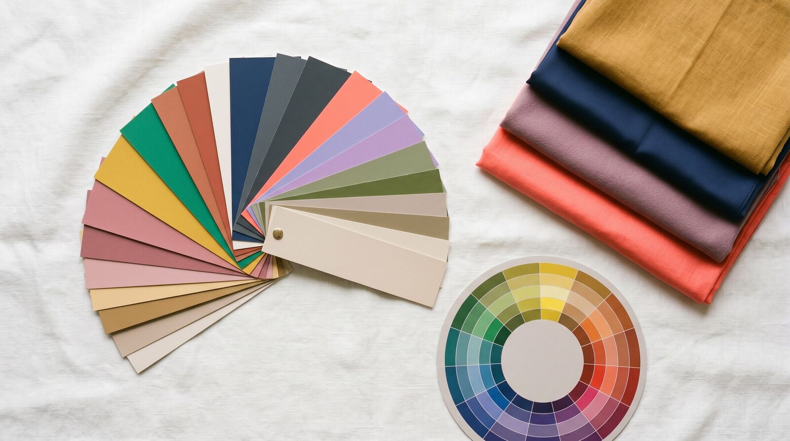
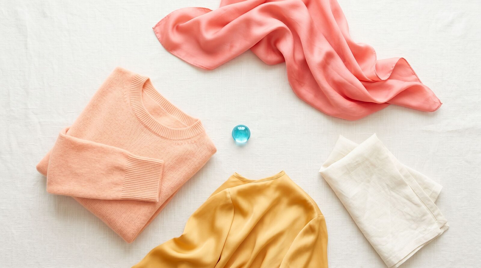
Your color palette
Spring works because it pairs warm undertone with high clarity. Every color in your palette has visible light in it — nothing is muted, nothing is dusty, nothing is greyed. That is what separates you from autumn (which shares your warmth but goes earthy) and winter (which shares your clarity but goes cool).
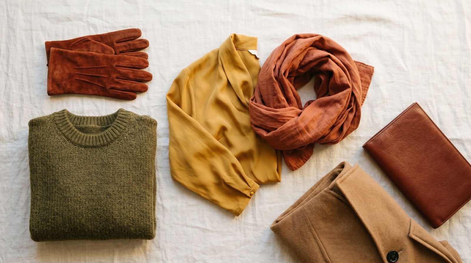
Start with three hero colors. Coral is your power-meeting color — it warms your face the way a navy suit warms a finance bro, except people will actually remember you. Warm ivory is your true neutral, the cleaner alternative to white that doesn't fight your skin. Light camel is your work-coat, your trench, your trousers — the backbone tone that lets the brighter pieces breathe.
Then layer in the brights. Bright aqua and periwinkle play the cool-accent role that black plays for everyone else. Watermelon pink and bright coral red are your evening and event colors. Golden yellow is for the days you want to walk into a room and have the lighting director adjust to you.
What to wear
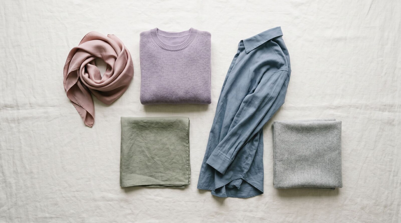
Best neutrals. Skip black and pure white. Use warm ivory, light camel, soft mint, and light warm brown as your foundation pieces. They hold the wardrobe together without fighting your face. For a near-black, use deep warm brown or navy with a teal cast.
Statement colors. Coral, watermelon pink, bright aqua, and golden yellow are made for you. Wear them in the pieces that frame your face — blouses, scarves, blazers, knit tops. The closer the color gets to your collarbone, the harder it works.
Print and pattern. Florals on a warm-ivory or soft-mint base, watercolor prints with coral and aqua, painterly stripes in warm tones. Avoid heavy black-based prints, muted-grey ditsy florals, and anything in burgundy + olive together — those palettes belong to autumn.
Metals. Gold, rose gold, and warm brass. Silver reads cold against your skin and dulls the color of whatever you are wearing. If you must wear silver (a watch, a wedding band), keep it small and away from your face.
Makeup undertone. Choose foundation labeled warm or golden, not neutral or cool. Lipstick families: coral, peach, warm pink, terracotta, warm red. Eyeshadow: peach, soft gold, warm taupe, soft turquoise. Skip cool-mauve lipstick and grey-toned eyeshadow — they age you instantly.
What to avoid (and why)
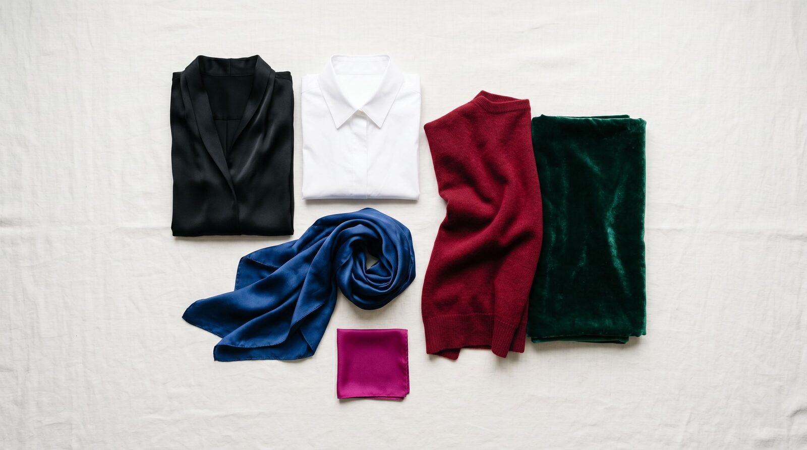
- True black near the face — pulls warmth out and creates harsh contrast that ages you in photos. Fine on shoes, bags, and below-the-waist pieces.
- Pure white — too sharp against your warm skin; makes you look red or sallow. Use warm ivory or cream instead.
- Burgundy and oxblood — your autumn cousins look incredible in these; on you they read heavy and aging.
- Dusty rose, mauve, and dusty plum — these are summer colors. The dustiness fights your clarity and turns your skin grey.
- Slate grey and cool charcoal — they drain the warmth from your face. If you need a grey, use warm taupe or light camel.
- Cool-toned beige (the kind with a pink cast) — looks chalky on warm skin. Reach for warm ivory or buttercream.
Spring in Bangkok
Bangkok light is your friend. The strong warm sun outside and the warm-white interior lighting in most Thai retailers actually flatter your palette — coral, peach, and golden yellow read true here in a way they wouldn't under London grey. The trade-off is humidity: thin spring pastels can go translucent when damp. Stick to viscose, Tencel, and lightweight linen with proper linings.
For corporate Sathorn and Silom, build your work base in light camel and warm ivory, then bring spring in through a coral or watermelon-pink blouse under the blazer. Uniqlo carries warm-ivory and light-camel basics seasonally — the warm white tees and camel trousers are reliable building blocks. Lyn Around leans warm and bright, especially in their event-wear. Issue has the coral-and-peach hand-painted prints that look like they were designed for spring tones.
For shopping trips, EmQuartier has the cleanest stock of warm-toned basics, Siam Paragon carries international brands with proper warm-undertone color matching, and the ICONSIAM Issue and Lyn Around stores are good for prints. Creative neighborhoods like Thonglor and Ekkamai give you room to push the brights — bright aqua jumpsuits and golden-yellow knits read confident there, where they would feel costumey in a Sathorn boardroom.
A practical Bangkok note: warm-undertone foundations are easier to find than you'd think. Most Thai-market foundation lines are calibrated for golden-warm Asian skin by default, which is exactly what you need. The trap is imported "neutral" lines from Western brands — they often skew too cool for spring skin tones.
Three flavors of Spring
Spring isn't one palette — it's three. Most people sit in one of these sub-seasons, and finding yours unlocks the colors that actually pull their weight.
- Light Spring — softer, lighter Spring. Pale coral, buttercream, soft aqua. Sits next to Light Summer.
- True Spring — the warmest, clearest Spring. Coral, golden yellow, bright aqua. The classic warm palette.
- Bright Spring — the brightest, clearest Spring. Hot pink, lime green, royal blue. Sits next to Bright Winter.
If your Spring colors sometimes look "too much" or "too washed out," you may be one of these sub-seasons rather than True Spring proper.
Use your colors with our services
A color palette is only useful if you actually wear it. Our Style Consultation gives you your full personalised spring palette, three outfit examples in the colors that work hardest on you, and a rule for when to break the palette and when to stay inside it. From there, our Personal Shopping service finds the pieces in Bangkok that actually exist in your colors — not the close-enough versions that everyone settles for. If your closet already has the right pieces hiding in it, our Wardrobe Audit pulls the spring-friendly items forward and rehomes the ones fighting your undertone.
Style Consultation
Get your full color palette and 3 outfit examples in one session.