


If True Spring is sunshine at 10am, Light Spring is sunshine through a sheer linen curtain — same warmth, less wattage. You belong to the warm family, but everything about your colouring is dialled down a notch: the contrast between hair, skin, and eyes is gentle, the features blend together rather than pop apart, and the colours that flatter you are warm, light, and a touch milky.
This is the Spring sub-season most often misread as Summer. The reason is simple: when colouring is delicate, the eye reaches for soft pastels first, and the cool pastels are easier to find on the rack than warm ones. Once you nail the warm-light corner of the palette, your face stops looking tired and your wardrobe stops feeling like a series of near-misses.
How Light Spring differs from True Spring
True Spring runs hot, bright, and clear. Coral, golden yellow, grass green — every colour is fully saturated and the contrast is high enough to carry it. Light Spring is the same warm undertone with the volume turned down. Where a True Spring can wear pumpkin and tomato red, a Light Spring is happier in pale peach and light watermelon. Where True Spring loves bright aqua, Light Spring lives in soft aqua and pale periwinkle.
The shift is not just lightness — it is also clarity. Light Spring colours have a milky, creamy quality, as though warm cream has been stirred into them. That softness is what holds your features together; pure-saturated brights can crack the harmony. Read the parent guide on Spring Personal Color for the broader logic of warm-clear, then come back here for the lighter dialect.
How to know you're a Light Spring
- Your skin is fair to light with visible warm-peach or warm-ivory undertone — never olive or pink
- Hair is light: golden blonde, strawberry blonde, light warm brown, or honey with sun-lifted highlights
- Eyes are clear but soft: light blue, light green, light hazel, or warm light brown with golden flecks
- The contrast between your hair, skin, and eyes is low — features blend together gently
- You sunburn easily and tan slowly to a light golden, never a deep bronze
- Pale peach and warm ivory make your face look refreshed; saturated coral or true red feels like the colour is wearing you
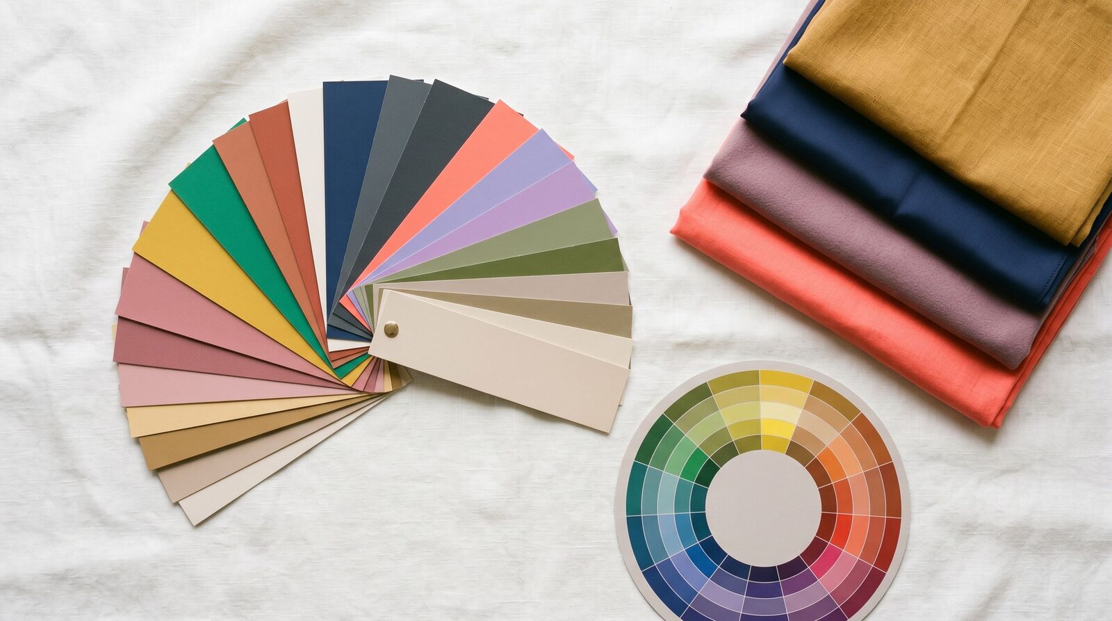
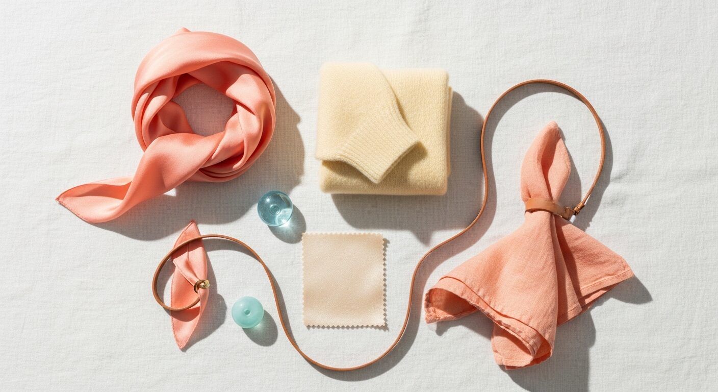
Your refined palette
Your palette logic is warm + light + slightly soft. Every colour reads as though it has been brushed with cream. That creaminess is the bridge between Spring's warmth and Light Summer's softness — it is what makes your sub-season distinct.
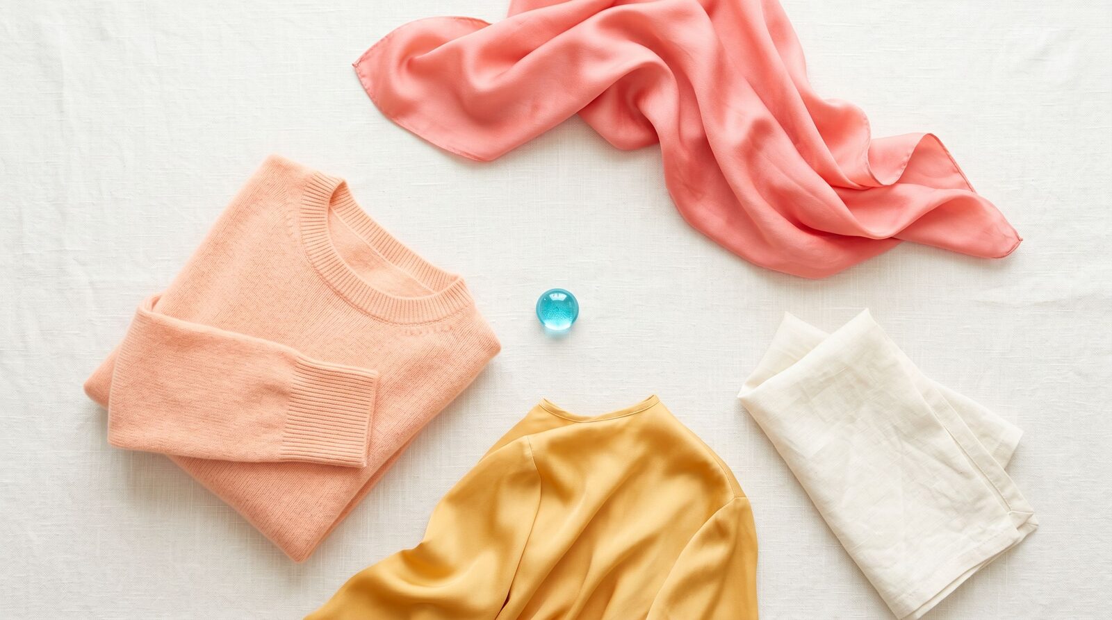
Three hero colours to anchor the wardrobe. Pale Peach is your power neutral-with-warmth — it brightens the face the way coral does for True Spring, but without the saturation that overwhelms your features. Warm Ivory is your truest neutral; it replaces white in everything from tees to silk camis. Light Camel is your tailoring backbone — trousers, trench coats, blazers — soft enough to play with the rest of the palette without going earthy.
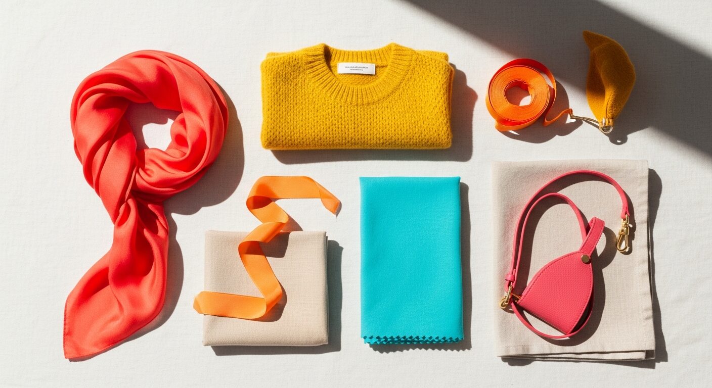
Then layer in the lifts. Soft Aqua and Pale Periwinkle are the cool-accent colours that play the role black plays for everyone else. Honey Gold and Champagne are your evening tones — gentle metallics that flatter without competing. Light Watermelon and Light Coral are your event pieces, the colours you reach for when the room needs to notice you.
What to wear
Best neutrals. Skip black, charcoal, and stark white. Build on Warm Ivory, Champagne, Light Camel, and the softest cool taupes. For a near-black, try a deep warm camel or a soft warm-brown — never charcoal or navy near the face.
Statement colours. Pale Peach, Light Watermelon, Soft Aqua, and Buttercream are made for you. Wear them as silk camis, lightweight knits, blouses, and scarves — pieces that frame the face. The closer the colour gets to your collarbone, the more it earns its keep.
Print and pattern. Watercolour florals on Warm Ivory or Buttercream grounds, soft botanical prints in peach and aqua, painterly stripes in Light Camel and cream. Avoid black-based prints, anything in saturated tropical brights, and burgundy-plus-olive combinations — those belong to autumn or winter palettes.
Metals. Light gold, rose gold, brushed champagne, and soft brass. Avoid heavy yellow gold (too saturated) and cool platinum (too sharp). If you wear silver, choose a warm brushed silver and keep it small.
Makeup undertone. Foundation labelled warm or warm-light — never cool or true neutral. Lipstick families: peach, soft coral, warm nude, light terracotta, soft warm pink. Blush in pale peach or apricot. Eyeshadow in soft gold, warm taupe, peach, and soft turquoise. Skip cool berry lip and grey eyeshadow — they pull the warmth straight out of your face.
What to avoid (and why)
- True black near the face — too much contrast for your low-contrast colouring; ages you instantly in photos. Fine for shoes and bags.
- Burgundy and oxblood — these are dark and warm-cool, the opposite of your light-warm. They drain colour from your skin and add ten years.
- Charcoal and slate — the coolness fights your warm undertone and the depth swamps your lightness. Use Light Camel or warm taupe for a similar grounding effect.
- Hot pink and saturated fuchsia — too clear, too cool, too loud for Light Spring features. The colour wins, you lose. Reach for Light Watermelon or Light Coral instead.
- Olive and khaki — the muted-warm of autumn pulls greyness into your skin. Mint Cream gives you a similar green without the dullness.
- Navy blue near the face — heavier and cooler than Light Spring colouring can carry. Pale Periwinkle gives you the blue family without the weight.
Light Spring in Bangkok
Bangkok light is warm and bright, which suits Light Spring more than most colourings — the same daylight that washes out cool pastels makes your peach and Champagne tones glow. The trade-off is sweat and translucency. Light fabrics in light colours go transparent quickly when damp, so you need slip linings or tighter weaves for daily wear.
For corporate Sathorn and Silom, anchor your work wardrobe in Light Camel and Warm Ivory tailoring, then bring the sub-season to life through Pale Peach or Soft Aqua silk camis under the blazer. Uniqlo carries reliable Warm Ivory tees and Light Camel trousers — the AIRism and supima cotton lines are a Light Spring's best friends here. Lyn Around leans warm-bright; their lighter peach and Buttercream pieces sit right in your palette. Issue has hand-painted Pale Peach and Soft Aqua prints that look custom-made for this sub-season. Greyhound and Disaya carry Champagne and Warm Ivory occasion pieces that work for events without going gold-heavy.
For shopping trips, EmQuartier has the cleanest selection of warm-light basics. Siam Paragon carries international brands with proper warm-light shade ranges (look at COS's lighter neutrals and Massimo Dutti's Champagne knits). ICONSIAM is your destination for Issue, Lyn Around, and Disaya. Creative neighbourhoods like Thonglor and Ekkamai are where you can push the lighter brights — a Light Watermelon midi dress reads chic there in a way it would not in a Sathorn boardroom.
A practical Bangkok note: ask Thai-market foundation lines for their warm-light or warm-1 shades, not their default warm-medium. Most lines are calibrated for warm-medium Asian skin, so a Light Spring needs to ask for the lighter end of the warm range.
How Light Spring compares to its neighbours
vs True Spring — Same warm undertone, very different intensity. True Spring carries fully saturated coral, pumpkin, and grass green; Light Spring needs the cream-stirred version of every colour. If your friend is a True Spring and you borrow her coral blouse, it will probably wear you instead of the other way around. Where True Spring wakes up in saturation, Light Spring softens in lightness.
vs Light Summer — The mirror across undertone. You and a Light Summer both run light, low-contrast, and delicate. The single difference is undertone: Light Spring runs warm (peach, ivory, honey), Light Summer runs cool (powder blue, rose, lavender). Hold a Pale Peach top and a Powder Blue top against your face on a clear-light day. Whichever one makes your skin glow rather than turn flat is your team. Many women pinged as Light Summer in less careful drapings are actually Light Spring with cool makeup undoing the diagnosis.
Use your colours with our services
A sub-season palette is most useful in the dressing room — when you can hold a Pale Peach silk against your face and compare it to a True Spring coral and finally see the difference. Our Style Consultation gives you your full Light Spring palette with the saturation rules that keep you on the warm-light corner. Our Personal Shopping service finds the cream-stirred warm pieces in Bangkok that actually exist in your sub-season — not the close-enough True Spring versions on most racks. If your closet already has the right pieces hiding among too-bright or too-cool ones, our Wardrobe Audit sorts them in a single session.
Style Consultation
Get your refined sub-season palette plus 3 outfit examples in one session.