


Bright Spring is the most vivid corner of the Spring palette — warm undertone meets winter-level saturation, and the result is a face built for jewel tones. If you have ever noticed that you photograph better in True Red than in beige, or that strangers compliment you when you wear Magenta but not when you wear Camel, you are probably Bright Spring. This is the sub-season that earns the brights.
The trap for Bright Springs is being talked into "tasteful" neutrals. Camel, sage, and dusty rose are coded as elegant in Western fashion media, but they are not your colours — they soften a face that was built for clarity. The fix is not to abandon neutrals; it is to choose the right ones (Crisp White, Black-Brown, your bright periwinkles) and let your jewel tones carry the rest.
How Bright Spring differs from True Spring
True Spring sits in the warm-clear centre. Bright Spring pushes further toward winter — higher contrast, slightly cooler-leaning brights, and a tolerance for jewel tones True Spring cannot quite carry. Where a True Spring loves Apricot and Pumpkin, a Bright Spring leans into Magenta, Hot Pink, and Royal Blue. Where True Spring stays away from Crisp White, Bright Spring can wear it.
The contrast difference shows in the face. True Springs tend to have golden or copper hair against medium-warm skin — the look reads warm and harmonious. Bright Springs often have darker hair (warm dark brown, near-black with red undertones) against light-to-medium skin and clear, bright eyes. The gap between hair and skin is sharper, and your wardrobe needs to match that sharpness. Read the parent guide on Spring Personal Color for the broader logic, then come back here for the high-contrast dialect.
How to know you're a Bright Spring
- Skin is clear and bright with a warm undertone — peach, golden, or warm porcelain
- Hair is darker than typical Spring: warm dark brown, deep auburn, or near-black with red highlights in sun
- Eyes are vivid and clear: bright turquoise, vivid green, sparkling hazel with golden flecks, or warm bright brown
- The contrast between your hair, skin, and eyes is high — features pop apart rather than blend
- Pure True Red, Magenta, and Royal Blue make you look striking; Camel, sage, and dusty rose make you look flat or tired
- Bright lighting — daylight, direct camera flash, harsh fluorescents — flatters you where it washes out softer colourings
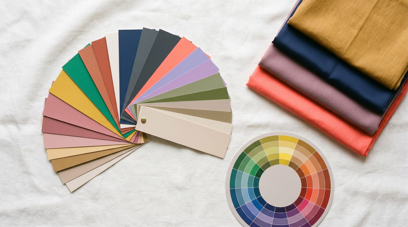
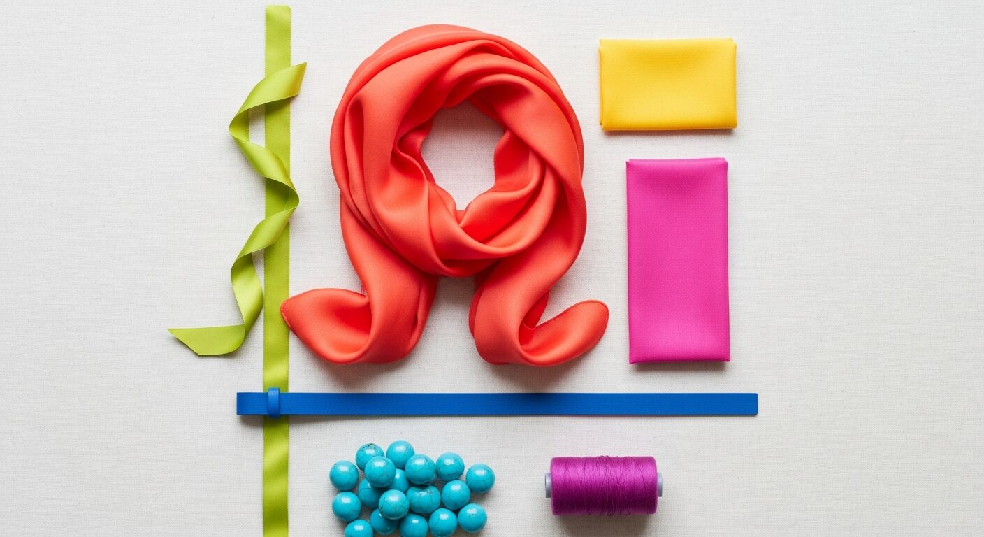
Your refined palette
Your palette logic is warm + clear + saturated + high-contrast. Every colour is fully saturated, every colour has visible warmth, and the palette tolerates jewel-tone depth that pure Spring palettes cannot. That tolerance is what bridges you toward Bright Winter — and what makes you the only Spring sub-season that genuinely loves Crisp White and near-black.
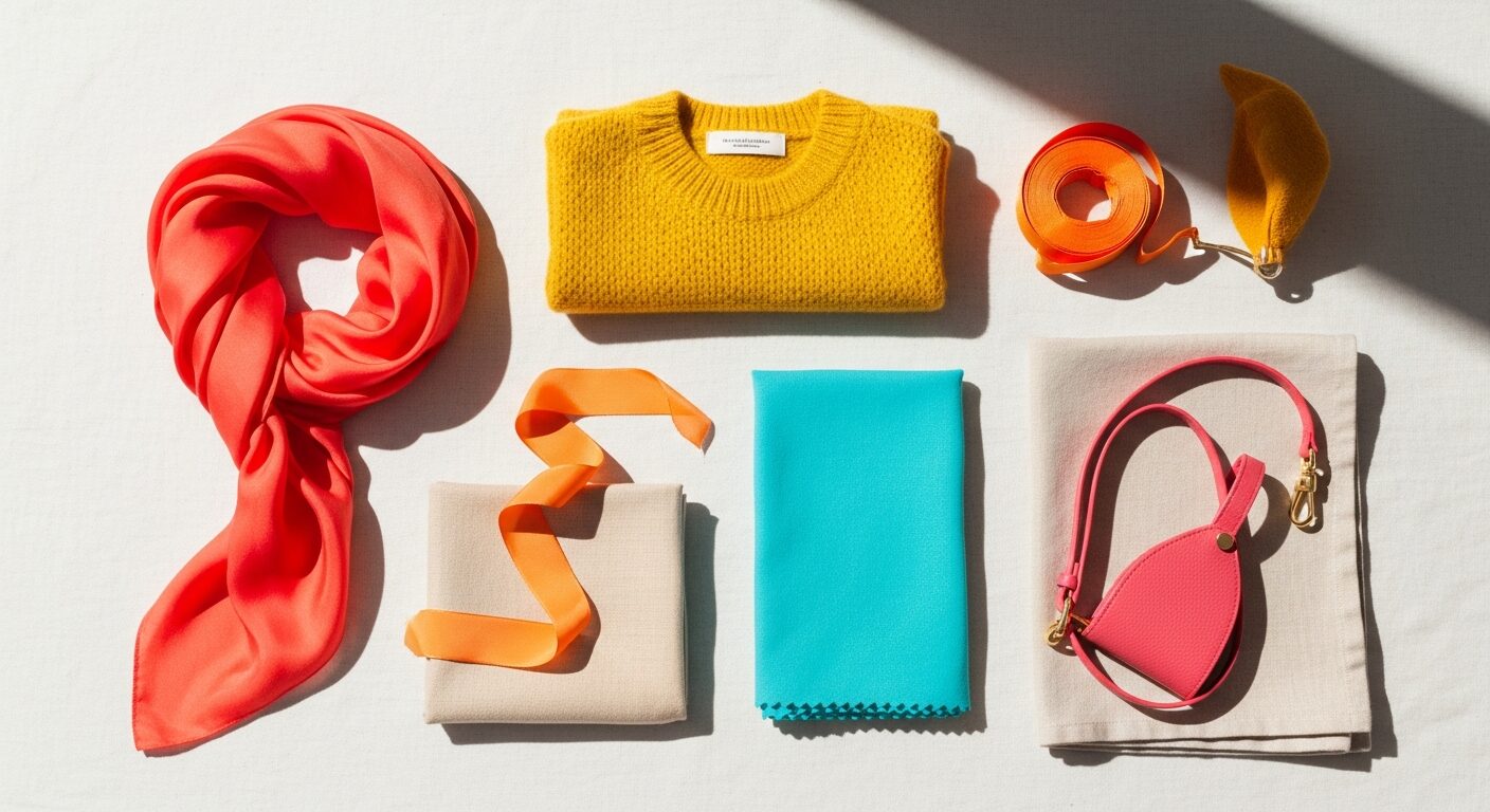
Three hero colours to anchor the wardrobe. Bright Coral is your power statement — warmer than Bright Winter's true red, more saturated than Light Spring's peach, and built to light up your face under any lighting. Crisp White is your true neutral; pure white reads clean and modern against your contrast, where it would feel chalky on Light Spring skin. Black-Brown is your dark anchor — soft enough to stay in the warm corner, dark enough to satisfy the contrast your face wants.
Then layer in the jewel tones. Royal Blue and Bright Turquoise are your blue family — they replace navy in the wardrobes of every other personal colour. Magenta, Hot Pink, and Bright Violet are your evening and event colours — saturated, warm, and unapologetic. Lime Green and Sunshine Yellow are your high-energy daytime brights. True Red is your power-meeting colour for the days you want the room to notice you the moment you walk in.
What to wear
Best neutrals. Skip Camel, dusty taupe, and sage. Build on Crisp White, Black-Brown, Bright Periwinkle, and a clean warm grey if you must. For a near-black, Black-Brown is your friend; pure black works only if styled with Crisp White at the neckline as a buffer.
Statement colours. Bright Coral, True Red, Magenta, Hot Pink, Royal Blue, and Bright Turquoise are made for you. Wear them in the pieces that frame your face — silk blouses, scarves, blazers, knit tops. Bright Springs are one of the few colourings that can do head-to-toe saturation: a Magenta dress, Royal Blue tailoring, or a True Red coat reads chic on you where it would read costume on most people.
Print and pattern. High-contrast graphic prints in Bright Coral and Crisp White, geometric prints in Royal Blue and Sunshine Yellow, painterly florals on Crisp White grounds with full-saturation flowers. Avoid muted watercolour florals, dusty mauve ditsy prints, and anything in burgundy-plus-olive — those palettes flatten your contrast.
Metals. Yellow gold, rose gold, and warm bright silver. Bright Spring is the rare warm sub-season that can wear silver — as long as it is a clean, bright silver rather than a cold platinum or pewter. Avoid antique brass and oxidised metals; they pull muted-warm into a palette that wants clear-warm.
Makeup undertone. Foundation labelled warm or warm-clear — never cool, neutral, or muted. Lipstick families: bright coral, true red, hot pink, magenta, warm berry. Blush in bright coral or warm pink. Eyeshadow in bright bronze, warm copper, vivid teal, soft magenta, and warm taupe. Skip dusty mauve lip and grey eyeshadow — they drain the brightness straight out of your face.
What to avoid (and why)
- Dusty rose and soft mauve — the dustiness fights your clarity; on you they read flat and slightly muddy. If you want a pink, reach for Hot Pink or a bright clear rose.
- Soft mauve and muted lavender — same dust problem, different family. Bright Violet is your friend; muted purples are not.
- Pewter grey and cool taupe — too muted and slightly cool for your warm-clear palette. They make your face look greyer in photos.
- Sage green — the muted-cool of summer pulls life out of your skin. Lime Green or Bright Turquoise gives you green energy without the dullness.
- Camel and warm beige — the True Spring power neutral, but on you it reads soft and slightly tired. Crisp White or Bright Periwinkle does the same job with more pop.
- Muted olive and khaki — the muted-warm of autumn drains your contrast. If you must wear olive, choose a saturated, clear version and pair with a Crisp White silk at the neckline.
Bright Spring in Bangkok
Bangkok light treats Bright Springs well. The strong warm sun and warm-white interior lighting in most Thai retailers actually pull the saturation out of your jewel tones — Magenta reads true Magenta here, Royal Blue reads true Royal Blue, and your Bright Coral photographs cleanly even at the busiest BTS stations. The trade-off is fabric weight: saturated brights in heavy fabrics feel oppressive in 35-degree heat. Stick to viscose, silk blends, and Tencel for your statement pieces; save denser fabrics for evenings.
For corporate Sathorn and Silom, build your work base in Crisp White and Black-Brown tailoring, then bring Bright Spring to life through a Bright Coral or Royal Blue silk blouse under the blazer. Uniqlo is reliable for Crisp White basics and saturated solid tees in their seasonal colour drops — watch the True Red and Royal Blue collections. Lyn Around has the brightest dress collections in Bangkok; their Magenta and Bright Coral pieces sit directly in your palette. Issue carries hand-painted prints with full-saturation flowers that read like Bright Spring couture. Greyhound runs structured Crisp White and Black-Brown pieces that anchor a saturated wardrobe. Disaya has occasion-wear in Magenta and Bright Coral that flatters without fading.
For shopping trips, EmQuartier has the cleanest stock of saturated solids — look at COS, Massimo Dutti, and Zara's bright drops. Siam Paragon carries international brands with high-saturation collections. ICONSIAM is your destination for Issue, Lyn Around, and Disaya. Creative neighbourhoods like Thonglor and Ekkamai are where Bright Springs thrive — head-to-toe Magenta or a Royal Blue jumpsuit reads chic there in a way it would never in a Sathorn boardroom.
A practical Bangkok note: ask Thai-market makeup brands for their warm-clear or warm-bright shades — most are calibrated for warm-medium Asian skin, which works well for Bright Spring. The trap is "neutral" foundations from Western brands, which often skew slightly cool for your colouring. K-beauty bright-warm lines are often a better fit than European neutrals.
How Bright Spring compares to its neighbours
vs True Spring — Same warm undertone, higher contrast and slightly cooler-leaning brights. True Spring stays in the warm-medium centre; you push toward winter-level saturation and depth. If saturated Magenta and Royal Blue make you look striking and Apricot and Pumpkin feel slightly soft, you are Bright Spring not True Spring. The shorthand: True Spring is warm-bright, Bright Spring is warm-bright-with-edge.
vs Bright Winter — Same saturation and contrast, opposite undertone. Bright Winter is cool-clear; you are warm-clear. Hold a Bright Coral top and a true Magenta top against your face on a clear-light day. If Bright Coral lights you up and true Magenta feels slightly icy, you are Bright Spring. If true Magenta sings and Bright Coral feels slightly warm, you are Bright Winter. Many women pinged as Bright Winter in less careful drapings are actually Bright Spring — and vice versa. The undertone is the only reliable tiebreaker.
Use your colours with our services
A Bright Spring palette earns its keep in the dressing room — when you can hold a saturated Magenta silk against your face and finally see why it looks striking on you and costume-y on a Soft Autumn friend. Our Style Consultation gives you your full personalised Bright Spring palette, three outfit examples in the saturated colours that work hardest on you, and a clear rule for when to break the palette and when to stay inside it. Our Personal Shopping service finds the genuinely saturated, warm-clear pieces in Bangkok — not the muted versions stocked for "tasteful" buyers. If your closet has Bright Spring pieces buried under accidental Camels and dusty roses, our Wardrobe Audit sorts them in a single session.
Style Consultation
Get your refined sub-season palette plus 3 outfit examples in one session.