


If pale pink looks softer on you than coral and powder blue makes your face look brighter than navy ever has, you are looking at a Light Summer palette. Light Summer is the most delicate corner of the cool family — pale skin, light cool hair, soft eyes, and a face that lives at the high end of the value scale. Depth overwhelms you; lightness lets you glow.
Light Summer is often misread as either Light Spring (because of the lightness) or True Summer (because of the cool undertone). The reality is you sit at the meeting point of both — cooler than a Light Spring, lighter than a True Summer. Get the diagnosis right and dressing becomes simple. Wear it wrong and you spend years wondering why your face looks blurred in photos.
How Light Summer differs from True Summer
Light Summer and True Summer share the same cool undertone, but they live at very different value points. True Summer can carry slate blue, muted plum, and pewter without losing the face — those mid-tone cool colors flatter their slightly deeper hair and eyes. On a Light Summer, the same depth pushes the face down. Your features are paler, your contrast is lower, and your palette needs to follow.
Light Summer also leans softer in chroma than people expect. Within Summer, you sit closer to Light Spring than to Soft Summer — your colors are clear-pastel rather than dusty-muted. Powder blue, pale pink, and soft periwinkle are clean and luminous, not heavily greyed. If you want to go deeper, the parent Summer Personal Color palette is the right reference, but stay in its lighter half.
How to know you're a Light Summer
- Hair is naturally pale: ash blonde, light ash brown, or cool light brown without warm highlights
- Skin is fair to light with cool pink undertones; you blush easily and burn before you tan
- Eyes are light and cool: blue, blue-grey, soft green, or pale cool hazel — never a deep golden brown
- Silver jewelry brightens your face; gold makes your skin look slightly tired or yellow
- Pastels look intentional on you, where on most people they read flat
- Black and rich navy near the face make your features blur; powder blue and pale pink sharpen them
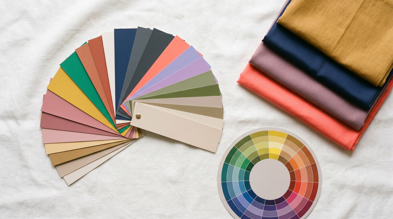
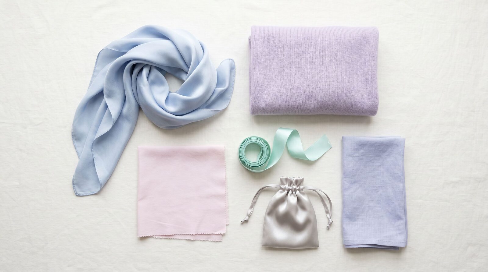
Your refined palette
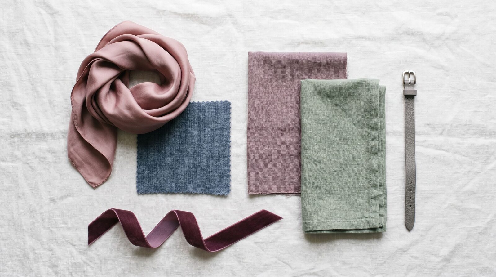
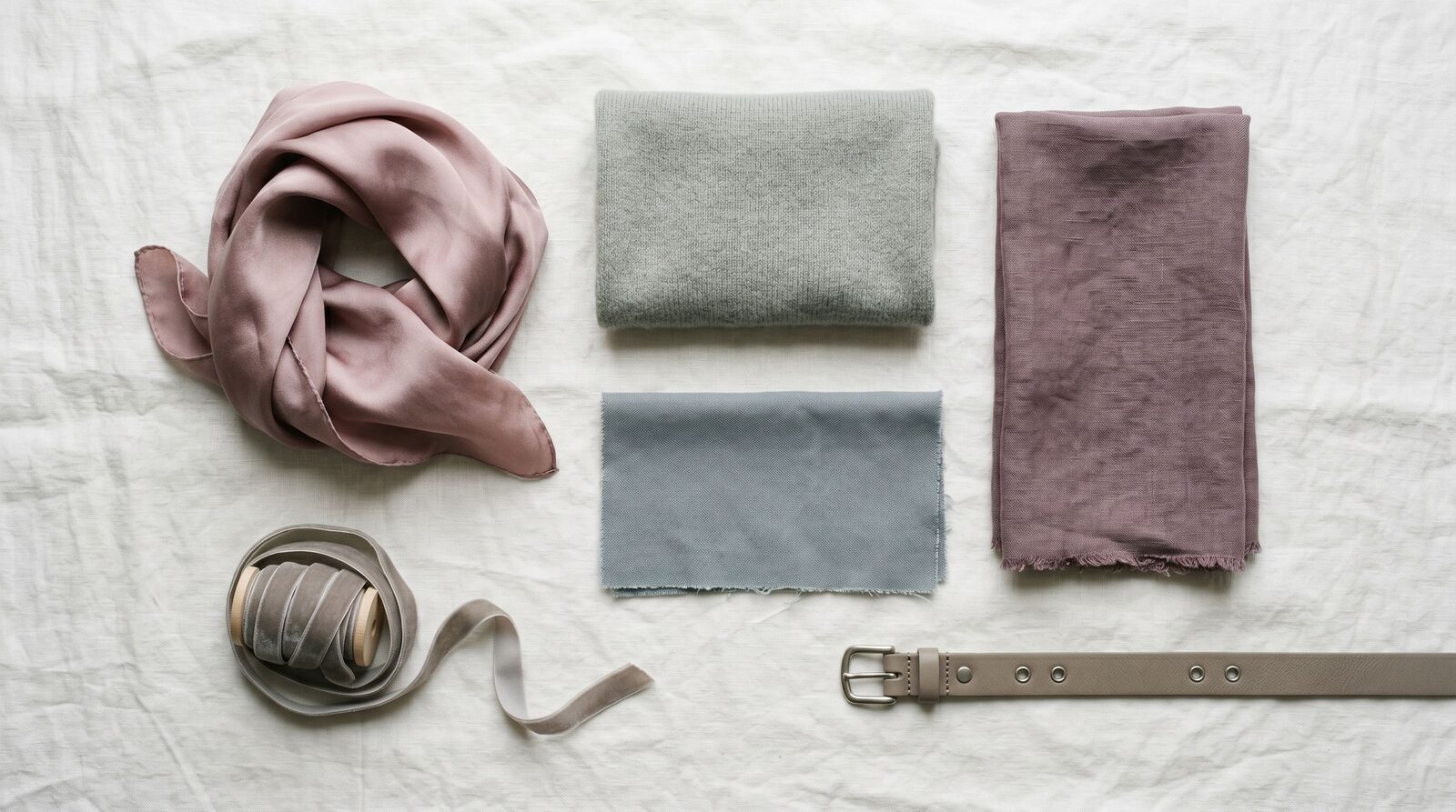
Light Summer works because every color has been pulled toward the pale end of the cool spectrum. There is enough white in each tone to keep it luminous, but not so much that it loses identity. Powder blue is your archetypal color — a clean, cool, light blue that lifts your eyes and warms your face at the same time. Pale pink is your romantic neutral, the alternative to bright pink that flatters cool fair skin without ever looking sweet. Soft lavender and light mauve are your evening colors — soft enough to suit you, distinct enough to register as a choice rather than a default.
Cool white and pearl grey are your foundational neutrals. They replace the bright white and charcoal that the rest of the world uses. Built around these, the palette stays cohesive: powder blue with pale pink, light sage with cool mint, soft periwinkle with light plum. Tonal pairings are your friend, because they sustain the gentle low-contrast effect your face naturally carries.
Three hero colors to start: powder blue for daily wear and meetings, pale pink for face-framing pieces (blouses, scarves, knit tops), and soft lavender for evenings and occasions where most people would reach for something darker.
What to wear
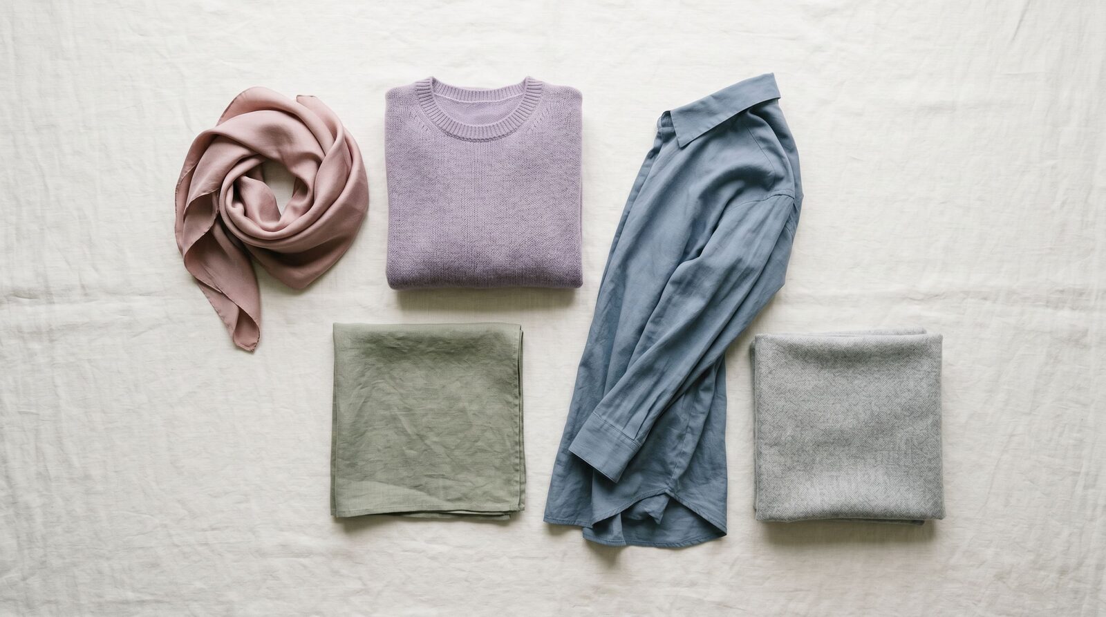
Best neutrals. Cool white, pearl grey, light mauve, and soft periwinkle. Skip black, charcoal, and rich navy — they create more contrast than your features can hold. For a structured workpiece, light pewter grey trousers do the job a darker grey would do for someone else, but on you they keep the palette from collapsing.
Statement colors. Powder blue, pale pink, soft lavender, and cool mint. These look deliberate and considered on you and slightly washed out on most other seasons. Wear them in the pieces that frame your face: silk blouses, knit tops, scarves, and dress collars.
Print and pattern. Watercolor florals on cool-white grounds, pale-pink-and-powder-blue stripes, soft botanicals in mint and lavender. Avoid bold geometric prints in black-and-white, tropical brights, and anything with mustard or burnt orange. Keep the contrast within the print low — high-contrast prints fight your face.
Metals. Silver, white gold, platinum, and pale pearl. Rose gold works in small doses if it leans cool. Yellow gold drags warmth into a palette that does not want it.
Makeup undertone. Cool, pink-leaning, never bronzed. Foundation labeled cool, pink, or porcelain — never warm or golden. Lipstick families: pale pink, soft mauve, cool nude, soft berry. Blush in cool pink or soft rose. Skip warm coral, terracotta, and bronzer entirely — they make Light Summer skin look muddy.
What to avoid (and why)
- Black — too dark, too harsh, and creates contrast your face does not naturally carry. Use light pewter grey or soft periwinkle as your structured neutral instead.
- Mustard yellow — too warm and too saturated for your soft cool skin; pulls your face yellow and ages you in photos.
- Burnt orange and rust — reads loud and dated against light cool skin. The autumn family wears these beautifully; you do not.
- Camel and warm caramel — the spring/autumn power neutral, but on you it goes flat and sallow. Use light mauve or pearl grey instead.
- Tomato red and bright warm red — the warm clarity overwhelms your softness. If you want red, use cool soft red or muted berry.
- Olive and forest green — too warm and too deep. Light sage is your cool, pale alternative and reads fresh in Bangkok light.
Light Summer in Bangkok
Bangkok's strong warm light is the biggest practical challenge for Light Summer. The afternoon sun has an orange cast that can make pastel cool colors look slightly faded if you wear them in flat synthetic fabrics. The fix is not to abandon your palette — it is to give your colors texture. Linen, cotton-modal, and lightly textured viscose hold the cool tone better than slick polyester, because the weave catches light and adds dimension your color alone cannot.
For corporate Sathorn and Silom, build your work base in pearl grey and light mauve, then carry the palette forward with powder-blue blouses and soft-periwinkle scarves. Uniqlo has a cool-leaning core palette that works hard for Light Summer — their cool whites, pale-pink tees, and light-grey trousers are reliable foundations. Lyn Around runs feminine pale-pink and lavender pieces that look made for your skin. Issue and Disaya carry softer florals if you choose the watercolor prints over their bolder ones.
For shopping, EmQuartier and Siam Paragon stock the cool-pastel basics — COS and & Other Stories at Paragon both lean Light Summer in core season. ICONSIAM is the right destination for occasion pieces in soft lavender and light plum. Creative neighborhoods like Thonglor and Ekkamai are friendly to monochromatic Light Summer dressing — head-to-toe powder blue or all-pale-pink tonal looks read intentional there.
A practical Bangkok note: most local foundation lines lean warm-golden by default, which is exactly the wrong undertone for Light Summer. Look for K-beauty cool-pink lines, the lightest cool shades from Western brands at Sephora EmQuartier, or get matched in person at a department store cosmetics counter. Your shade exists, but you may have to ask twice.
How Light Summer compares to its neighbors
Light Summer vs True Summer. True Summer is the deeper, more clearly cool version. They can carry slate blue, muted plum, and pewter without losing the face. On you, those mid-tones push your features down. Stay in the lighter half of the cool palette — powder blue rather than slate, pale pink rather than dusty rose, pearl grey rather than pewter.
Light Summer vs Light Spring. Light Spring shares your lightness but with a warm undertone — peach, light coral, ivory, golden cream. They glow in warm pastels; you glow in cool pastels. The diagnostic test: hold peach against your face, then pale pink. If pale pink keeps your skin smooth and peach makes you look slightly tired, you are Light Summer. The lightness is the same; the undertone decides everything.
Use your colors with our services
A Light Summer palette is only useful if you can find it in Bangkok and actually wear it. Our Style Consultation gives you your full personalised Light Summer palette, three outfit examples in the colors that work hardest on you, and a clear rule for when to wear powder blue versus when to reach for pale pink. From there, our Personal Shopping service finds the cool-pastel pieces that actually exist on Bangkok shelves — there are fewer of them than warm options, and we know the racks. If your closet is already half-Light-Summer but you cannot tell which pieces are pulling their weight, our Wardrobe Audit sorts your true cool pastels from the accidentally-warm pieces in a single session.
Style Consultation
Get your refined sub-season palette plus 3 outfit examples in one session.