


Deep Autumn is the richest, most saturated expression of the Autumn family. You still carry a warm undertone, but everything about your colouring has more weight to it — your hair is darker, your eyes are deeper, and the colours that look richest on you are the ones with serious depth. Where a True Autumn looks expensive in clear rust, you look expensive in burgundy, mahogany, and espresso.
The most useful way to think about your colours: imagine a glass of aged red wine, a polished mahogany table, espresso in a copper cup, deep autumn forests at dusk. Anything warm and richly saturated belongs to you. Anything pastel, icy, or chalky does not.
How Deep Autumn differs from True Autumn
The shared DNA is warm undertone and earth-rooted colours. The difference is depth. True Autumn sits in the middle of the Autumn family — saturated enough to read warm and present, but not so deep they become winter-heavy. Deep Autumn carries one extra notch of darkness across the board: deeper hair, deeper eyes, and the colouring weight to balance proper burgundy, espresso, and deep forest green as everyday colours rather than evening-only statements.
Practically, your colours are the Autumn Personal Color palette with the depth dialled up. Where True Autumn wears rust, you wear deep rust or burgundy. Where they wear forest green, you wear deep forest green. Where they wear camel, you wear bronze or warm brown. Same family, more weight.
How to know you're a Deep Autumn
- Vein colour at your inner wrist looks olive or dark green-blue.
- Hair is dark brown, near-black with warmth, dark chestnut, or deep auburn — never ash, platinum, or light blonde.
- Eyes are deep — dark brown with golden flecks, deep hazel, dark olive-green, or near-black with warm undertones.
- Skin can range from light to deep, but always carries warm depth — never pink-and-pale, never ash-cool.
- Gold jewellery flatters you, but choose antiqued or rich finishes rather than light, bright yellow gold.
- Saturated colours sit comfortably on you — burgundy, deep teal, and espresso don't overwhelm you the way they would a Soft or True Autumn.
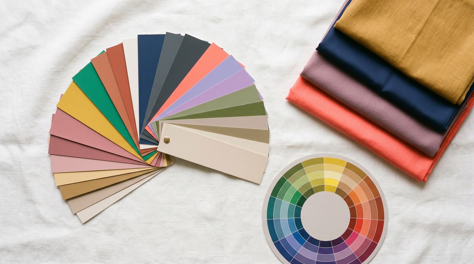
Your refined palette
Deep Autumn is built on three principles: warm undertone, deep saturation, and rich (rather than icy) darkness. Every colour in your palette has been mixed with a touch of brown, gold, or warmth — none of them are cool jewel-tone or pastel. That's why your palette feels grown-up and considered, where the same outfit in cool darks (charcoal, navy, true black) would feel slightly off.
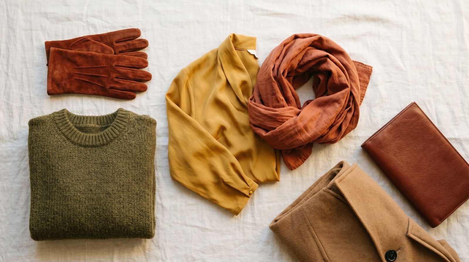
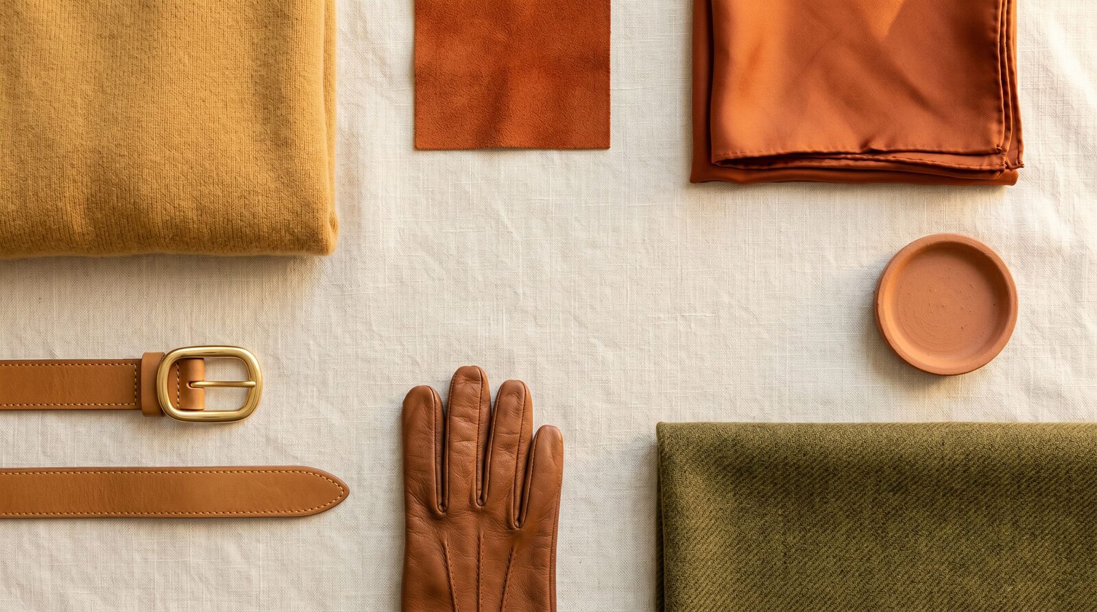
Your hero colours each play a specific role. Burgundy is your power colour — richer than black, more flattering than navy, and your single most useful evening and meeting shade. Espresso is your everyday neutral; it does the work of black with much more warmth in the face. Deep forest green is your unexpected versatile shade, pairing with almost everything in your palette and reading polished in office, weekend, and evening. Deep rust and pumpkin spice are your warm "personality" colours that lift the depth into something more dynamic.
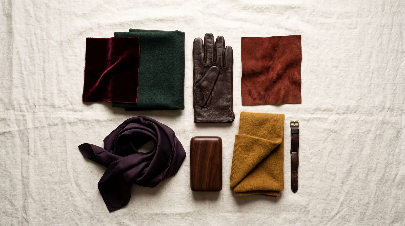
Your darks (espresso, mahogany, deep forest) replace black for tailoring. Your warm mid-tones (deep rust, deep mustard, bronze) inject colour and personality. Your statements (burgundy, deep teal, eggplant) carry weight and luxury for evening and important occasions.
What to wear
Best neutrals
- Espresso and warm brown instead of black for tailoring — slimming and polished, with more warmth
- Mahogany and bronze for blazers, coats, and bags
- Deep olive as your "navy alternative" — once you trust it, your most-used neutral
- Cream or warm beige for shells and shirts (avoid pure white, which is too cool)
Statement colors
- Burgundy for evening, formal, and important meetings — your single most powerful colour
- Deep rust and tomato red for tops and dresses near the face
- Deep teal for occasion pieces and one-shoulder evening dresses
- Eggplant for autumn-winter knitwear and evening blazers
- Deep mustard for accent pieces — scarves, knits, accessories
Print and pattern guidance
- Animal print (leopard, snake, tortoise) belongs to you — the warm browns and tans live in your palette
- Rich earthy florals on dark backgrounds (deep forest, espresso, burgundy bases) work beautifully
- Avoid pastel florals and high-contrast cool prints (black-and-white, navy-and-white) — they fight your warm depth
- Stripes in espresso-and-cream or burgundy-and-cream read more flattering than navy-and-white
Metals
- Antiqued gold, bronze, copper, and warm brass are your jewellery family
- Rich, deep finishes look more refined on you than light, bright shine
- Silver and white gold can read cold — if you love silver, choose a darker, warmer rose gold or champagne
Makeup undertone
- Foundation: warm or warm-neutral undertone (yellow-gold base, never pink) — pick the deeper end of the warm range
- Lipstick: burgundy, brick red, deep terracotta, warm brown-rose, deep nude. Skip bright cool pinks, blue-reds, and light corals.
- Eyeshadow: bronze, deep copper, espresso, deep olive, plum. Skip frosty silver and icy lavender.
- Blush: deep peach, terracotta, or warm berry — never cool pink
What to avoid (and why)
- Pastel pink and baby pink — far too light and too cool for your depth; they make you look washed out and slightly costume.
- Powder blue and light aqua — both the wrong undertone and the wrong saturation. Deep teal does the same job correctly.
- Lemon yellow and clear primary brights — they belong to brighter, lighter seasons. Deep mustard works; lemon yellow doesn't.
- Mint green and light aqua — too cool and too icy. Deep teal or deep forest green carries the same family with the right warmth.
- Lavender and cool purples — they fight your warm depth. Eggplant and aubergine work; lavender doesn't.
- Cool charcoal grey — your warm depth doesn't sit comfortably with cool greys. Espresso or warm brown does the same slimming job with more warmth.
Deep Autumn in Bangkok
The honest truth: Deep Autumn carries the heaviest end of the Autumn palette, and that can read out of season under midday Bangkok sun. A wool burgundy coat in April is unwearable. The fix isn't to abandon your colours — it's to translate them into Bangkok-appropriate weights and silhouettes.
For office wear in Sathorn or Silom, lean on your warm mid-tones in summer fabrics: an espresso linen blazer over a cream shell, a deep olive cotton trouser with a deep rust blouse, or a burgundy silk dress under a cream linen jacket. These read corporate and polished without the heaviness of a full Deep Autumn winter palette. Save the heavy mahogany and forest pieces for evening client dinners and air-conditioned meetings, where the depth reads expensive rather than out of season.
For weekend and creative dress codes around Thonglor, Ari, and Ekkamai, your rich palette has an unexpected edge — most people wear either black or pastel, and a tonal Deep Autumn outfit (espresso, deep rust, bronze accessories) photographs beautifully and stands apart from the crowd.
A few practical Bangkok shopping notes:
- Uniqlo carries deep brown, deep olive, and burgundy in their seasonal lines — strong starting point for basics
- Lyn Around and Disaya stock the rich-toned occasion dresses (burgundy, deep teal, deep rust) that suit you naturally
- Greyhound has structured tailoring in deep neutrals
- Issue carries deep earthy colours in linen and cotton for tropical-friendly weights
- EmQuartier and ICONSIAM stock Massimo Dutti, COS, and Sandro — all of which carry deep warm pieces in their core lines
- Try clothes on near a window in natural light rather than under cool LED — your palette is designed for warm light and reads as intended there
How Deep Autumn compares to its neighbors
Vs True Autumn — Same warm undertone, but you carry more depth. Where True Autumn looks rich in clear rust and golden mustard, you look richer in deep rust and burgundy. The tell: if a True Autumn wore your espresso suit, it would look slightly heavy on them; if you wore their cream-camel-rust outfit, it would look slightly light on you. You sit one notch deeper across the whole palette.
Vs Deep Winter — Same depth, very different undertone. Deep Winter looks expensive in cool jewel tones — true emerald, deep sapphire, pure white, true black, magenta. Deep Autumn looks expensive in warm depth — burgundy, espresso, deep teal, deep rust. The misdiagnosis between these two is genuinely common because both can carry darkness and saturation. The deciding factor is always undertone: gold flatters you (Deep Autumn); silver flatters them (Deep Winter).
Use your colors with our services
Confirming Deep Autumn from True Autumn (or Deep Winter) is hard to do alone — the differences are subtle and the wrong call costs you for years. Our Style Consultation confirms your exact sub-season under daylight-balanced light and produces a printed swatch palette you can carry shopping. Our Personal Shopping service then sources pieces in the warm-deep range that actually suits you, so you stop accidentally buying cool darks that drain your warmth. And if your closet mixes Deep Autumn pieces with cool jewel tones or pastels that fight your colouring, a Wardrobe Audit sorts what stays, what gets re-styled, and what should go.
Style Consultation
Get your refined sub-season palette plus 3 outfit examples in one session.