


You have probably owned a shirt that everyone complimented you in, and another in almost the same color that made you look like you had not slept in days. That is not lighting or mood — that is personal color. Some shades push warmth and brightness into your face; others pull it out. The colors that work for you are not random, and once you know them, shopping gets dramatically simpler.
Personal color analysis is the system that explains why. It groups people into four seasonal palettes — Spring, Summer, Autumn, Winter — based on skin undertone, contrast level, and how vivid a color you can wear without it overpowering you. Take our 6-question quiz to find your season in about a minute, then come back here for the deeper read.
What is personal color analysis?
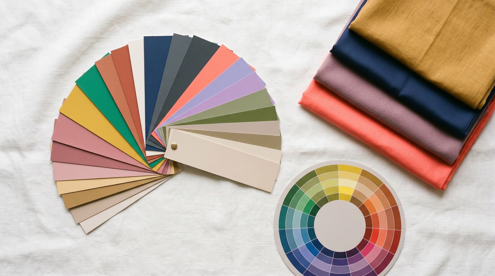
Personal color analysis sits on three properties of your natural coloring:
- Undertone — the warmth or coolness of your skin. Warm undertones lean golden, peachy, or olive; cool undertones lean pink, rose, or bluish; neutral undertones sit between.
- Value — how much contrast you naturally have between your hair, skin, and eyes. Dark hair on fair skin is high contrast; light brown hair on tan skin is low contrast.
- Chroma — how vivid or muted a color you can wear. Some faces handle pure saturated red; others look better in a softer brick or rose.
Your season is the combination of those three. A Winter has cool undertone, high contrast, and high chroma — they wear true black and pure white better than anyone. A Summer has cool undertone, lower contrast, and softer chroma — pure black overwhelms them, but a dusty rose looks effortless. The same logic produces Spring (warm and bright) and Autumn (warm and muted).
The 4 seasons at a glance
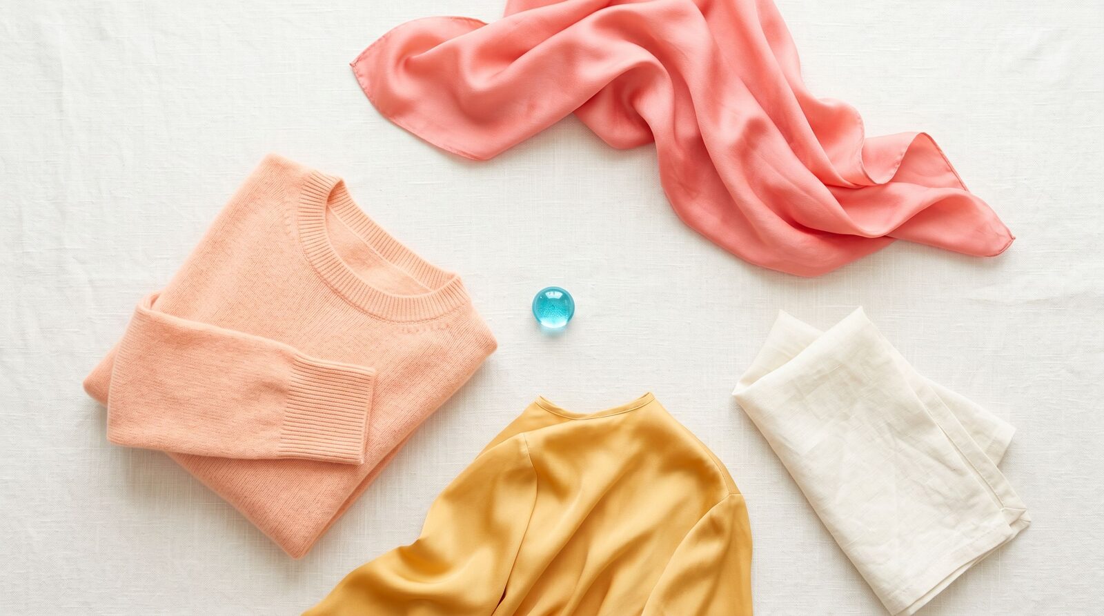
Spring — warm and bright. Springs have a golden, peachy, or ivory undertone with a clear, fresh quality. Their best colors are warm and saturated: coral, peach, warm turquoise, camel, and ivory. Pure white and pure black tend to harden the face.
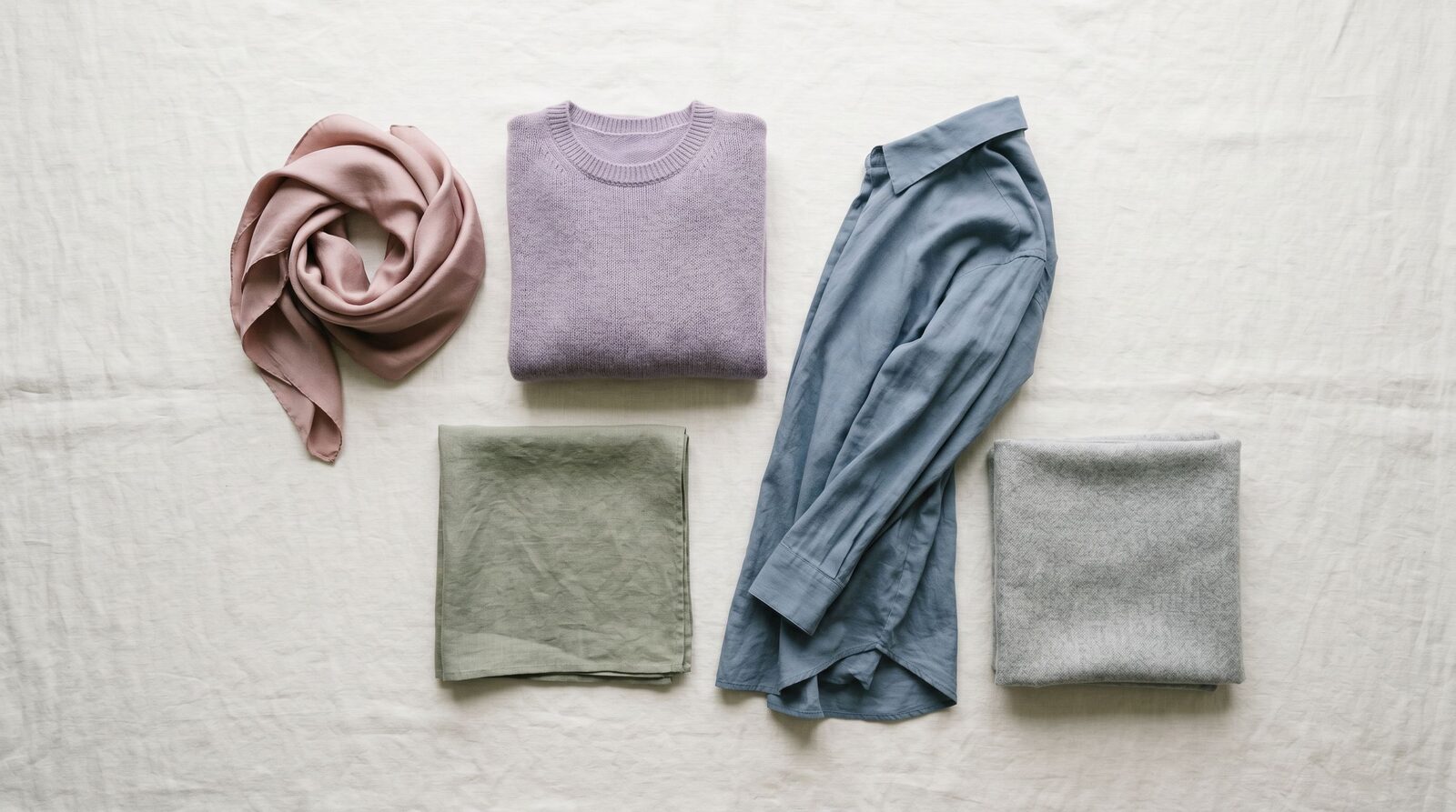
Summer — cool and soft. Summers have a cool pink or rose undertone with low to medium contrast. Their best colors are cool and muted: dusty rose, soft navy, lavender, sage, and powder blue. High-saturation colors like emerald or fuchsia overwhelm them.
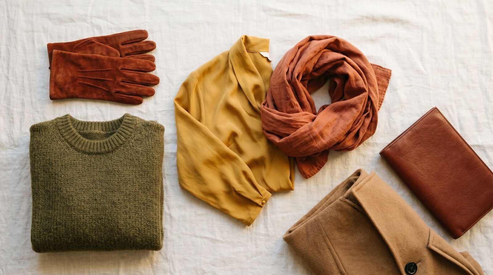
Autumn — warm and muted. Autumns have a warm golden, bronze, or olive undertone with a rich, earthy quality. Their best colors are warm and deep: rust, mustard, olive, terracotta, and deep teal. Pure pastels look chalky on them.
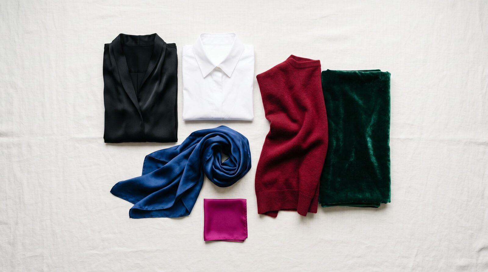
Winter — cool and clear. Winters have a cool undertone with high natural contrast. Their best colors are cool and saturated: true black, pure white, royal blue, fuchsia, and emerald. Beige and warm earth tones make them look washed out.
How to find your season
Before you take the quiz or book a session, three quick at-home tests will get you most of the way there:
- The vein test. Look at the underside of your wrist in natural daylight. Predominantly green veins suggest warm undertone (Spring or Autumn). Predominantly blue or purple veins suggest cool undertone (Summer or Winter). A mix of both points toward neutral.
- The jewelry test. Hold a piece of gold jewelry against your bare skin, then a piece of silver. Whichever makes your skin look brighter and more even is your match. Gold flatters warm undertones; silver flatters cool. If both work, you are likely neutral.
- The sun test. When you spend a day in the sun without sunscreen, do you tan to a golden brown (warm) or burn pink first and tan slowly (cool)? People who go straight from pale to deep tan with little burning are usually warm; people who freckle or burn lean cool.
These tests are a starting point, not a verdict. The most reliable result comes from systematic draping under neutral light, which is what the quiz simulates and what an in-studio session does in person.
Personal color in Bangkok
Most clients we see in Thailand sit in warm or warm-neutral undertone territory — variations of Spring, Autumn, or warm-leaning Winter. Pure cool Summer is less common but does appear, often in clients with a slight pink flush and very fine hair. None of this is a hard rule; we have all four seasons walk into our studio every month.
Bangkok lighting is the bigger trap. Outdoor sun here is warm and intense, which makes warm tones look richer and cool tones look slightly off. Indoor mall lighting is usually cool LED, which does the reverse. The most common shopping mistake we see is buying a top in EmQuartier under cool light, then wearing it outside or to a warm-lit restaurant and wondering why it suddenly looks dull. The fix is not to shop in only one type of light — it is to know your palette so you choose colors that work in both.
Use your colors with our services
Personal color analysis is built into every Style Consultation we run — you leave with your season, a fabric swatch palette, and a shopping list mapped to it. Once you know your colors, our Personal Shopping service can source pieces in your palette so you stop accidentally buying tops in shades that work for someone else's complexion. And if your closet is already full of items that do not flatter you, a Wardrobe Audit sorts what stays, what gets re-purposed, and what should go.
Style Consultation
Get your personal color and palette in one session — at our Bangkok studio or online.