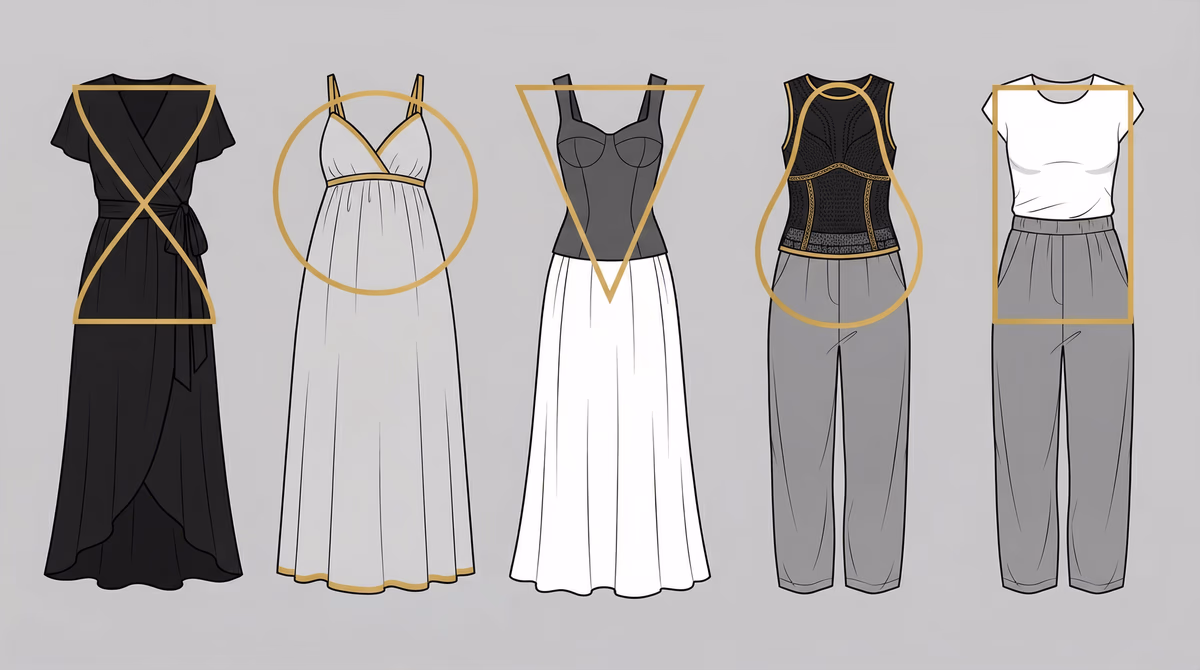
Color is the first thing people notice about your outfit, before cut, fit, or brand. Colors that harmonize with your natural coloring make you look healthier and sharper, even in a plain T-shirt. Wrong colors add years to your face and wash out your skin.
Personal Color Analysis Explained
Personal color analysis is a system for matching spectrum colors to your natural coloring: skin tone, undertone, eye color, and hair color.
Color analysis uses color theory to predict how hues interact with your natural pigmentation. Combined with body type analysis, it forms the foundation of personal style.
| Color Type | Effect on You |
|---|---|
| Enhancing colors | Make your skin look clear and bright, your eyes sparkle, and your features pop |
| Draining colors | Make you look tired, washed out, or create shadows and emphasize imperfections |
| Neutral colors | Safe but not optimal. They neither enhance nor detract. |
Fill your wardrobe with enhancing colors, use neutrals as supporting pieces, and keep draining colors away from your face.
The Seasonal Color System
The standard color analysis system categorizes people into four seasonal types: Spring, Summer, Autumn, and Winter. Each season has a distinct color palette based on three characteristics.
Every season maps to a specific combination of these three dimensions.
1. Hue (Warm vs. Cool)
- Warm hues have yellow/golden undertones (think sunrise)
- Cool hues have blue/pink undertones (think ocean)
2. Value (Light vs. Dark)
- Light values are softer, more delicate
- Dark values are deeper, more intense
3. Chroma (Muted vs. Clear)
- Muted colors are softened, grayed, subtle
- Clear colors are pure, saturated, vibrant
Season Combinations
| Season | Hue | Value | Chroma |
|---|---|---|---|
| Spring | Warm | Light | Clear |
| Summer | Cool | Light | Muted |
| Autumn | Warm | Dark | Muted |
| Winter | Cool | Dark | Clear |
Determining Your Season: The Analysis Process
Step 1: Identify Your Undertone (Warm vs. Cool)
Your undertone is the hue beneath your skin's surface and the starting point for color analysis.
Try these tests to determine whether you have warm or cool undertones.
The Vein Test
Look at veins on your wrist in natural light:
- Green veins = Warm undertone
- Blue/purple veins = Cool undertone
- Can't tell/both = Neutral (you may be a muted season)
The Jewelry Test
Which looks better on you: gold or silver?
- Gold looks better = Warm
- Silver looks better = Cool
- Both look good = Neutral
The White Test
Hold pure white and cream/ivory fabric near your face:
- Cream flatters you = Warm
- Pure white flatters you = Cool
- Look for which makes your skin glow vs. look sallow
The Sun Test
How does your skin react to sun?
- Golden tan = Warm
- Pink/burn = Cool
Step 2: Assess Your Value (Light vs. Dark)
Value refers to the overall lightness or darkness of your natural coloring.
Overall Contrast
Look at yourself in a mirror in natural light. Compare your hair, skin, and eyes:
- Low contrast (similar values) = Light season
- High contrast (dramatic difference) = Dark season
Hair Color
- Light blonde, ash blonde, light brown = Light
- Dark brown, black, deep auburn = Dark
Skin Tone
- Fair, porcelain, light = Light
- Medium-deep, olive, rich = Dark
Eye Color
- Light eyes (pale blue, green, hazel) = Light
- Dark eyes (deep brown, black, intense green) = Dark
Step 3: Determine Your Chroma (Muted vs. Clear)
Chroma refers to the purity and intensity of color that suits you.
The Draping Test
Hold bright, clear colors vs. muted, soft colors near your face:
- Clear colors make you glow = Clear season
- Muted colors look better = Muted season
Natural Coloring
- Clear, distinct features = Clear
- Soft, blended features = Muted
Eye Clarity
- Bright, sparkling eyes with clear whites = Clear
- Softer eyes, clouded whites = Muted
The Four Seasons in Detail
SPRING (Warm, Light, Clear)
Fresh, warm, and clear, like early morning light.
Natural Coloring
- Skin: Ivory, peachy, golden beige, warm porcelain
- Hair: Blonde to light brown with golden tones
- Eyes: Bright blue, green, hazel, light brown with warmth
- Overall: Fresh, youthful, delicate but vibrant
Best Colors
- Neutrals: Cream, camel, warm beige, light navy, warm gray
- Colors: Coral, peach, warm pink, clear aqua, bright periwinkle, warm yellow, kelly green, bright warm red
- Metals: Gold, rose gold, copper
Celebrity Examples
Gwyneth Paltrow, Cameron Diaz, Blake Lively, Emma Roberts
Bangkok Shopping Tips
- Best brands: Zara (spring collections), & Other Stories, COS (look for warm tones)
- Thai designers often use spring-friendly colors - check Siam Center
SUMMER (Cool, Light, Muted)
Soft, elegant, refined, gentle - like a hazy summer day.
Natural Coloring
- Skin: Pink, rosy, cool beige, porcelain with pink undertones
- Hair: Ash blonde, ash brown, gray-brown, soft gray
- Eyes: Blue, gray, soft hazel, cool green - often appear soft, not sparkling
- Overall: Soft, elegant, refined, gentle
Best Colors
- Neutrals: Soft white, gray, navy, taupe, rose-brown, cocoa
- Colors: Powder pink, lavender, periwinkle, soft blue, mauve, dusty rose, raspberry, soft teal
- Metals: Silver, white gold, platinum, pewter
Celebrity Examples
Emily Blunt, Naomi Watts, Diane Kruger, Sarah Jessica Parker
Bangkok Shopping Tips
- Best brands: COS, Massimo Dutti (excellent muted palettes)
- Look for Japanese brands at Gateway Ekkamai - often use summer colors
AUTUMN (Warm, Dark, Muted)
Rich, earthy, warm, grounded - like fall foliage.
Natural Coloring
- Skin: Golden, bronze, warm beige, olive, rich and warm
- Hair: Auburn, copper, chestnut, dark brown with red/gold tones
- Eyes: Warm brown, hazel, green-brown, amber, olive green
- Overall: Rich, earthy, warm, grounded
Best Colors
- Neutrals: Cream, camel, chocolate brown, olive, warm gray, rust
- Colors: Burnt orange, terracotta, olive green, teal, warm burgundy, mustard, pumpkin, forest green
- Metals: Gold, bronze, copper, antique gold
Celebrity Examples
Julia Roberts, Jessica Alba, Jennifer Lopez, Drew Barrymore
Bangkok Shopping Tips
- Best brands: Zara (autumn collections shine), Massimo Dutti
- Chatuchak Market has great earthy tones in vintage sections
WINTER (Cool, Dark, Clear)
Dramatic, striking, high-contrast, bold - like a crisp winter day.
Natural Coloring
- Skin: Cool undertones, can be fair porcelain or deep olive/brown
- Hair: Black, dark brown, silver, stark white (all with cool tones)
- Eyes: Deep brown, black, bright blue, clear green - high contrast
- Overall: Dramatic, striking, high-contrast, bold
Best Colors
- Neutrals: True white, black, charcoal, navy, icy gray, pure white
- Colors: True red, royal blue, emerald green, hot pink, purple, icy blue, burgundy, lemon yellow
- Metals: Silver, white gold, platinum
Celebrity Examples
Lucy Liu, Megan Fox, Anne Hathaway, Keira Knightley, Lupita Nyong'o
Bangkok Shopping Tips
- Best brands: COS (excellent for minimalist winter palettes), Zara
- Central Embassy has the best curation of winter-friendly luxury brands
Special Considerations for Thai and Asian Coloring
Asian skin tones often fall into the warm category (Spring or Autumn), but there's significant diversity.
Common Thai Color Seasons
Warm Autumn (Most Common)
- Golden-olive skin
- Dark brown or black hair with warm undertones
- Brown eyes with golden flecks
- Best colors: Earthy tones, warm neutrals, rich colors
Warm Spring
- Lighter golden skin
- Brown hair with lighter undertones
- Warm brown or hazel eyes
- Best colors: Clear, warm colors, peachy tones
Cool Winter
- Cool-toned skin (less common but exists)
- Black hair with blue-black sheen
- Very dark brown or black eyes
- Best colors: Pure, clear colors, high contrast
Cool Summer (Rare but exists)
- Cool-toned light to medium skin
- Ash-toned hair
- Soft eyes
- Best colors: Muted, cool tones
Thai Skin Tone Nuances
Key Considerations
- Golden undertones are dominant - most Thai people have warm undertones
- Warm neutrals (cream, camel, warm gray) work better than stark white or pure gray
- Medium to deep value - darker seasons (Autumn, Winter) are more common than light seasons
- High-contrast colors often work well
- Test in Bangkok light, where strong tropical sun shifts how colors read
- Test colors in both natural Bangkok daylight and indoor AC lighting
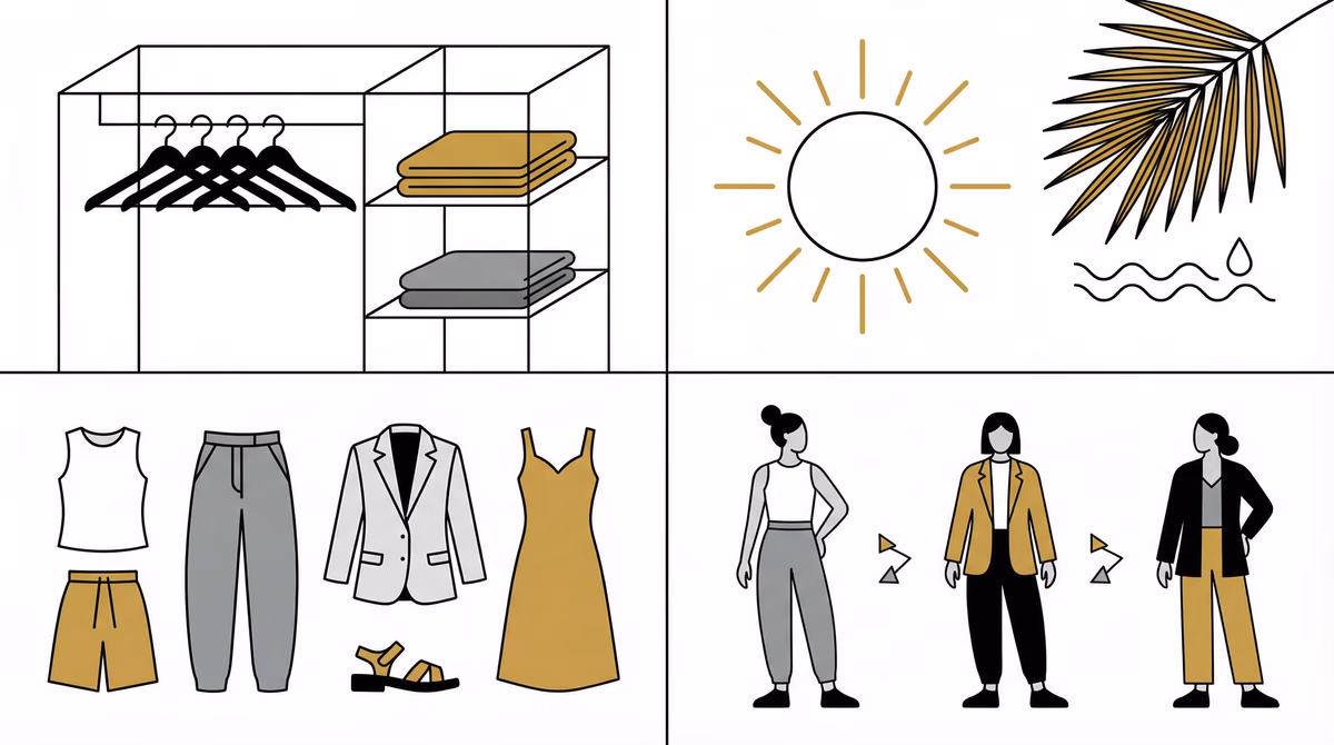
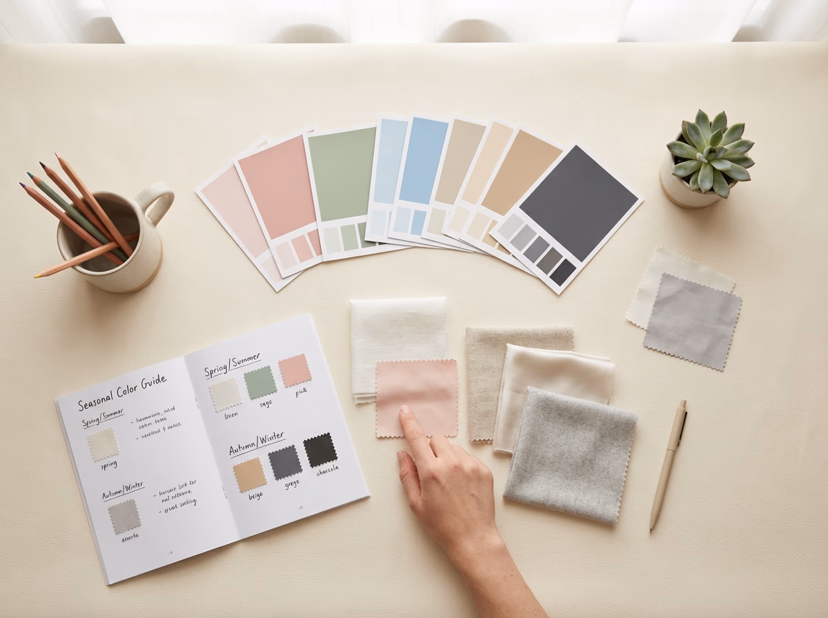
Building Your Color Palette
A practical framework for building a cohesive wardrobe with your seasonal colors.
70% - Neutrals (Your Season's Neutrals)
| Season | Recommended Neutrals |
|---|---|
| Spring | Cream, camel, warm navy |
| Summer | Soft white, gray, rose taupe |
| Autumn | Cream, chocolate, olive |
| Winter | Black, white, charcoal, navy |
Use these for pants, skirts, blazers, and basic tops - the foundation of your wardrobe. Learn how to build a capsule wardrobe for Bangkok's climate.
20% - Supporting Colors
| Season | Supporting Colors |
|---|---|
| Spring | Coral, aqua, warm pink |
| Summer | Soft blue, lavender, rose |
| Autumn | Rust, teal, olive green |
| Winter | Royal blue, emerald, burgundy |
Use for shirts, blouses, and casual pieces. Choose 3-4 colors from your seasonal palette.
10% - Accent Colors
| Season | Accent Colors |
|---|---|
| Spring | Bright coral, clear yellow |
| Summer | Raspberry, periwinkle |
| Autumn | Burnt orange, mustard |
| Winter | True red, hot pink |
Use for accessories and statement pieces - 1-2 colors that energize your outfits.
Practical Application
Shopping with Your Color Palette
Shopping Strategy
- Create a color swatch card - print or collect fabric swatches of your best colors
- Keep swatches in wallet or phone for reference when shopping
- Photograph yourself in your best colors in natural light
- Use photos as shopping reference
- Test before buying - hold clothing near your face
- Check in natural light if possible
- Notice if it makes your skin glow or look dull
Adapting Trends to Your Season
Every trend has a version that works for your season.
Trend: Millennial Pink
- Spring: Choose warm, peachy pink
- Summer: Perfect as is (cool, soft pink)
- Autumn: Skip or choose salmon/terracotta instead
- Winter: Choose hot pink or skip
Trend: Earth Tones
- Spring: Choose warm camel, peach-beige
- Summer: Choose rose-brown, cool taupe
- Autumn: Perfect as is (your sweet spot!)
- Winter: Skip or use as small accents only
Trend: Bold Red
- Spring: Choose orange-red, warm tomato red
- Summer: Choose blue-red, raspberry
- Autumn: Choose brick red, rust red
- Winter: Choose true red, cherry red (your best!)
Makeup and Hair Color Harmony
Your color season extends to makeup and hair.
Makeup by Season
Spring Makeup
- Foundation: Warm, peachy undertones
- Blush: Coral, peach, warm pink
- Lipstick: Coral, warm pink, peachy nude
- Eyeshadow: Warm browns, peach, warm greens
Summer Makeup
- Foundation: Cool, pink undertones
- Blush: Rose, soft pink, mauve
- Lipstick: Rose, soft pink, berry
- Eyeshadow: Cool taupe, soft purple, gray-blue
Autumn Makeup
- Foundation: Warm, golden undertones
- Blush: Warm terracotta, peachy brown
- Lipstick: Warm brown, rust, terracotta
- Eyeshadow: Warm browns, olive, bronze
Winter Makeup
- Foundation: Cool undertones (can be fair or deep)
- Blush: Cool pink, berry, plum
- Lipstick: True red, berry, cool pink
- Eyeshadow: Cool taupe, navy, purple
Hair Color by Season
| Season | Best Hair Colors |
|---|---|
| Spring | Warm blonde, golden brown, honey highlights |
| Summer | Ash blonde, ash brown, cool highlights |
| Autumn | Auburn, copper, chestnut, warm chocolate |
| Winter | Black, deep cool brown, platinum blonde |
Common Color Analysis Mistakes
Mistake #1: Ignoring Undertone
The Problem: Choosing colors based on value/chroma alone
The Fix: Always start with warm vs. cool determination
Mistake #2: Wearing Draining Colors Near Face
The Problem: Wearing wrong colors in tops/jackets
The Fix: Wrong colors can work in bottoms, but keep face-framing pieces in your palette
Mistake #3: Being Too Rigid
The Problem: Avoiding all "wrong" colors
The Fix: Small amounts of non-optimal colors in accessories is fine
Mistake #4: Not Considering Makeup
The Problem: Wearing right clothing colors but wrong makeup
The Fix: Makeup should follow your seasonal palette too
Mistake #5: Forgetting Lighting
The Problem: Testing colors only in store lighting
The Fix: Always check in natural daylight when possible
Advanced Color Analysis
The 12-Season System
Some analysts use a 12-season system to place people who fall between traditional seasons.
| Base Season | Variations |
|---|---|
| Spring | Light Spring, True Spring, Bright Spring |
| Summer | Light Summer, True Summer, Soft Summer |
| Autumn | Soft Autumn, True Autumn, Dark Autumn |
| Winter | Bright Winter, True Winter, Dark Winter |
Tonal vs. Seasonal Approach
Tonal Approach
Focuses on one dominant characteristic:
- Light
- Deep
- Warm
- Cool
- Bright
- Muted
Seasonal Approach
Considers all three dimensions together for a full color profile.
Either approach works. Pick the one that clicks.
Color Analysis in Bangkok Context
Workplace Considerations
Bangkok workplaces often require conservative dress. Here is how to incorporate your colors.
Conservative Industries (Law, Finance)
- Stick to your neutral palette: navy, gray, black (if Winter), brown tones
- Add subtle color in accessories or inner layers
Creative Industries
- Freedom to wear full palette
- Use color to express creativity and stay professional
Climate Considerations
Practical Bangkok Color Tips
- Lighter values of your colors work better in hot months
- Darker colors absorb heat, so save them for indoor days
- Prints and patterns can combine multiple palette colors
- Avoid pure white in rainy season (dustproof colors)
- Light grays show sweat - consider this for important meetings
Cultural Color Meanings in Thailand
| Color | Meaning in Thai Culture |
|---|---|
| Yellow | Royal color, auspicious |
| Pink | Tuesday color, now popular across fashion |
| Purple | Saturday color, sophisticated |
| Black | Acceptable in fashion but traditionally for mourning |
| White | Traditionally for funerals, but acceptable in fashion |
DIY vs. Professional Color Analysis
When DIY Works
- You have a clear season (obvious warm/cool, clear contrast)
- You enjoy research and experimentation
- You have time to test
- You're confident in your self-assessment
When Professional Analysis is Worth It
- You're between seasons (neutral undertones)
- You've tried DIY with confusing results
- You're making significant wardrobe investments
- You want makeup and hair color guidance
- You value expert eye and precision
A professional session covers more ground than DIY testing.
Professional Analysis Benefits
- Precise draping with professional color swatches
- Expert assessment of subtle undertones
- Personalized palette card
- Makeup and hair color recommendations
- Wardrobe audit using your colors
- Shopping guidance
Maximizing Your Color Analysis Results
1. Audit Your Current Wardrobe
- Separate clothes into "love wearing," "okay," and "never reach for"
- Notice if your "best" pieces are in your seasonal palette
- Identify which "wrong" colors you can repurpose (bottoms, layers)
2. Start with Basics
- Replace basics in wrong colors with palette-correct versions
- Prioritize items near your face (tops, jackets)
- Build the rest over time
3. Use Color Strategically
- High-stakes situations: Your best colors
- Casual settings: Experiment with palette
- Accessories: Bridge between seasons
4. Update Makeup and Hair
- Switch to palette-appropriate makeup
- Consider hair color adjustment
- See how it changes your overall look
Results You Can Expect
Clients who wear their season's colors report faster morning routines, fewer regret purchases, and more compliments at work.
The payoff shows up in several areas.
Color Analysis Benefits
- Faster shopping because you know which colors to grab
- More compliments from colleagues and friends
- Better photographs since your palette is photogenic on you
- Cohesive wardrobe where every piece works together
- Your features stand out, not your clothes
Next Steps
Your Color Analysis Action Plan
- Determine your season using the tests in this guide
- Create a color swatch card with your palette
- Audit your wardrobe - what stays, what goes
- Plan strategic replacements - start with basics near face
- Experiment with your palette and try new colors
- Update makeup and accessories to complement
- Watch the compliments roll in
Ready for Professional Color Analysis?
Our styling team runs full color analysis sessions with professional draping, personalized palette cards, and wardrobe integration.
Style Consultation
Full style consultation including color analysis, personal palette development, and wardrobe recommendations
Learn more →Related Services:
Color analysis is a framework, not a cage. Use it to sharpen your look and express your personal style.
Napasorn (Mind) Phetpirun
Co-Founder & Head of Fashion Strategy • 8+ years experience
Mind is the key driving force behind the vision and creative direction of All That's Stylist. With over 8 years of experience in fashion styling, including Commercial and Editorial Styling, she brings together creativity, precision, and a deep understanding of personal branding. At All That's Stylist, she serves as Head Stylist, Image Strategist, and Project Lead, overseeing creative standards, team direction, and the quality of outcomes delivered to corporate and private clients.